Tuesday, February 24, 2009

Week 6-Catherine B.

This picture, by Johan Spanner for the NYTimes, which represents the problems that Iraqi widows face, is both chilling and dramatic. I love the fact that the children are everywhere in this picture and that the women stand emotionless as only one man looks like he’s paying attention to the reporter. The use of seemingly spooky light in the background only adds to the photograph.
I liked this photograph, also by Johan Spanner for the NYTimes, because of its framing. The long colorless hallway makes the viewer think about the wideow's loneliness. While the eye is drawn to her long road ahead, the eye, because of the color contrast, is also drawn to her in black. The almost hidden child makes the photograph more chilling.


This picture, by Andrew Scrivani for The New York Times, makes the food jump out of the picture. The fact that he decided to put the couscous in focus and leave the bowl out of focus means that the viewer’s eye is immediately brought to the focal point of the picture—the food. The positioning of the spoon only adds to the effect.



Monday, February 23, 2009

Week 6- Lyndsey Matthews

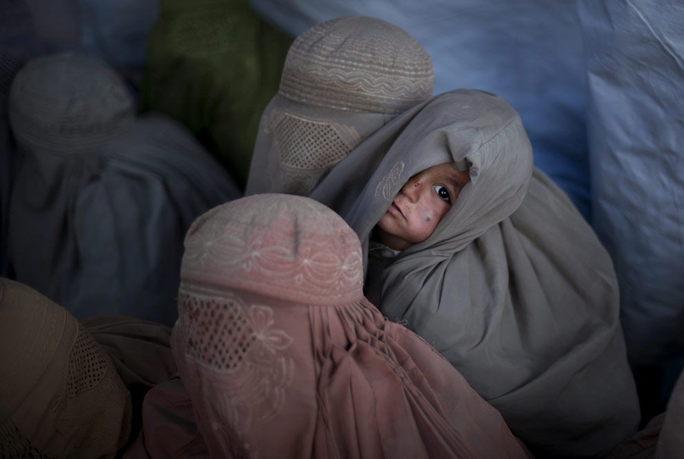
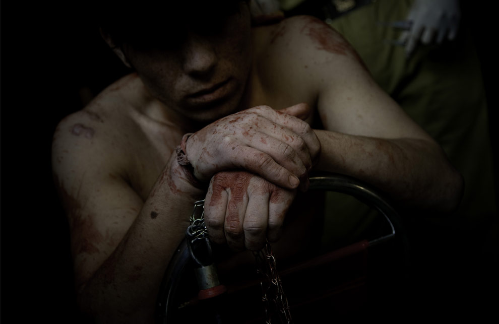
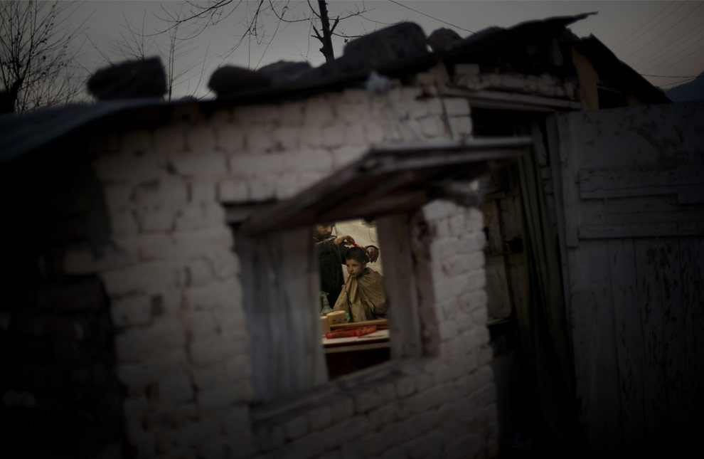
The following three images are by the AP photographer Emilio Morenatti's recent visit to Pakistan. I discovered them on Boston.com's Big Picture blog.

A Pakistani child looks on as women covered with burqas from the tribal region of Bajur and Mohmand agency wait to be registered at the Jalozai refugee camp near Peshawar, Pakistan, Friday, Jan. 30, 2009. (AP Photo/Emilio Morenatti)

While looking through the first few of Morenatti's photos I find that they are very dark and ominous. While at first I was unsure about this, I am growing to like this dusky and overcast style because his images are never drab. The connection with the child in this image really pulls you into this world.

A Shiite Muslim worshiper receives medical care in a clinic, after flagellating himself with knives in a procession in Rawalpindi, Pakistan, on Monday, Feb. 16, 2009. (AP Photo/Emilio Morenatti)

Although there is blood clearly smeared on this man's hands and body this image is not grotesque. The subdued colors help as well as shrouding the man's face. You feel as if you know something about this human, but you also feel that he is not being exploited by the photographer.

A Pakistani barber cuts the hair of a boy in a barber shop on the outskirts of Islamabad, Pakistan, Friday, Jan. 31, 2009. (AP Photo/Emilio Morenatti)

The natural framing is what drew me into this photograph. There is a good feeling of space here both inside and out. While the focus is on the boy getting his haircut who is framed neatly in the center by the window, you also get a sense of what season it is by the bare branches outside the building as well as the detailing of the bricks.


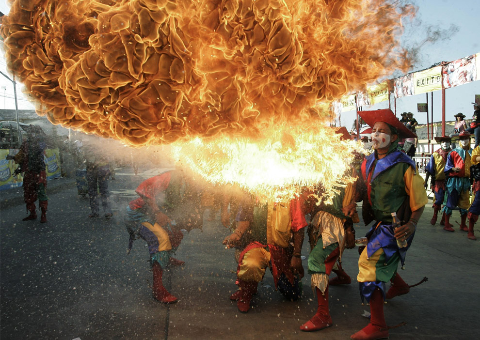
A group of jesters spit fire during a carnival parade in Barranquilla, Colombia, Sunday, Feb. 22, 2009. (AP Photo/ Fernando Vergara) Seen on Boston.com's Big Picture blog.

This is an astonishing capture. You can feel the heat as well as the lighter fluid splattering forth from his mouth. The texture in the flames is incredible. The colors, the movement, everything in this photo makes you stop and wonder at it in awe.

Tuesday, February 17, 2009

Class 5 -Chika A.

This photo was taken by Sam Mircovich for Reuters. It's a weather photo of an impending rainy day over Los Angeles. The picture captures the bleak gloom of weather, but encapsulates the city's skyline in an almost snowglobe fashion. I think the photographer made good use of natural light.

This picture features He Pingping, the world's shortest man. It was taken by Yoshikazu Tsuno for AFP. This picture works well because it's all about perspective. Even without a caption, a viewer could see that Pingping is unusually small for a man, because of the juxtaposition with the shoe.


This picture comes from Shaun Curry for AFP. It shows a child playing rock, paper, scissors with a robot at the Science Museum in London. I think it works because although there are only two objects in the frame, a viewer knows exactly what is going on. And the blue backdrop, whether it be a wall, or cloth, is out of focus, and provides a good contrast.

Class 5-Eleni Crush

Source: http://www.nytimes.com/2009/02/18/nyregion/18insure.html?ref=nyregion

Another example of environmental portraiture. Although sometimes it's hard to appreciate these "staged" shots, I like how the bills are surrounding her (the accompanying article is about how uninsured young adults deal with expensive medical bills). The darkness of the room makes it hard to see her clearly, but adds to the entire "doom and gloom" message that the article carries.

Source: http://www.nytimes.com/2009/02/08/theater/08itzk.html?_r=1&scp=4&sq=maggie%20gyllenhaal&st=cse

This is from last Sunday's New York Times article about how actual couple Maggie Gyllenhaal and Peter Sarsgaard are appearing onstage together in a revival of Chekov's "Uncle Vanya" at the Classic Stage Company over on East 13th street. We were talking about environmental and celebrity photography last week, and I thought this was an especially effective image. Both Gyllenhaal and Sargaard are well respected and pretty famous actors in the independent film worlds and have had many photos taken of them, but this one uses color very well. I like the red on Maggie and how it pops from the otherwise grey tint of the rest of the shot. It says something about the couple and their chemistry. Also, it was a good choice to have Maggie looking away from the camera. Again, this brings personality and a different perspective to the shot.

Source: http://gothamist.com/2009/02/16/early_addition_198.php
Gothamist does this one feature daily where they round up quick news from around the city and it's always accompanied with a photo selected from a Flicker.com stream that I believe users can tag as "gothamist" and that's how the photos get to Gothamist. Granted, this isn't from a traditional media source but it's an example of how new media can fit into this whole equation. I love the perspective on this shot--traditionally the eye goes from left to right, but in this photo, the woman on the left is slightly out of focus, leaving the model on the right in focus, and it's very effective.

Tear Sheets // Feb. 17, 2009 // Rose Walano


The first picture was featured in The New York Times, concocted by Viktor Koen. It was paired with a (duh) article on cell phones. WHat I found interesting was the combination of a classically-styled, almost vintage shot of a business man with a modern piece of technology and the dated but moderately modern neon, motel-like sign connecting the two. It's a sassy combination of new and old that hints to the themes within the articles (i.e. what we've expected from cell phones thus far, where they are going). Ah, the power of Photoshop.

The second picture was also featured in The New York Times, this time in the Arts section. It was taken by Saeed Adyani for MGM Studios. The picture is of a cast member for the remake of Fame, a movie I have loved forever. More importantly though is the sly placement of this picture. It's the snapshot for an article called "California Beckons Film Crews." Seemingly, this is a relatively boring, business-related piece - not so interesting for the artsy types who read this section. However, I think the article became infinitely more intreating to people upon seeing this touchstone of a picture. And on an aesthetic level, I love the way light is captures, shining down on her from an angle. Class theater.

Finally, this last AP picture is of seven-year-old Aaron Van Blerkom. Thanks to this picture, he is now the most notorious contributor to the "Dear Mr. President" project. He has the most adorable smile - both innocent and mischievous - and this devilish quality make him more than just a child. He embodies youth and sweetness. The use of color in this picture is both eye-catching and symbolic. There is an excessive amount of red, white and blue. It drives the message home: kids can be patriots too. 


 http://www.nytimes.com/2009/02/15/nyregion/long-island/15Riceboat.html?ref=nyregion

The first picture uses color to attract attention. The red stands out against the icy background and emphasizes the ice boat- not the ice. The photographer used panning to great effect keeping the iceboat in focus and the background blurry, showing the speed of the boat. This really illustrates the story well- its about ice sailors who get excited when lakes, rivers and bays freeze because they enjoy they are “speed addicts.”

http://www.time.com/time/picturesoftheweek/0,29409,1879163_1844999,00.html


I love this picture of Michelle Pfifer (second picture) because it’s a unique type of a celebrity picture. Instead of taking a picture of just the celebrity, her face is barely showing in the corner of the picture and the paparazzi is taking over a picture. I’m not sure if the photographer intended for this picture to show what being a celebrity is like, but it does. It helps that Pfiffer’s face looks surprised and in awe instead of composed and smiley. The color helps make the picture stand out. 

http://news.bbc.co.uk/2/hi/in_pictures/7724355.stm

The third picture looks like an artsy display or a theater mask. Its actually part of a protest, a man is covered with what looks like blood and mud. The protest was held in Jakarta, Indonesia so the government would compensate people for displacements and injuries caused by a mud volcano in 2006. The picture is very effective because the man has his eyes closed and looks injured. It makes the reader imagine what the actual injuries would look like. The costume was very smart on the part of the protestors because effective images are more likely to get attention. I’m sure there were banners at the event, but this is a way so people who speak any language can effectively understand the story.


Class 5- By Tala Al-Husry