Wednesday, February 25, 2009

Tala Class 6

I liked this picture because it shows part of the cartoon so the reader can understand from the picture what the people are protesting. But I wish the picture was a wider shot so you could see a few more faces.  It feels like there were less people at the protest but the photographer is trying to make it look like more people were there.  


This picture illustrates the point of the article, that teenagers are taking care of their elders. Even though it’s a sweet looking picture, I feel like the point could have been better illustrated if the elderly person was in bed or sitting down. I like that the girl’s picture is hanging in the background. 


I like this picture because it shows the contrast between the area that was affected by the fire and the area that wasn’t. it also illustrates the danger the firemen are in. The fact that the truck and firemen are in the picture show the scale of the fire.


Tuesday, February 24, 2009

Chika Anoliefo: Week 6


This picture was taken by Amir Cohen for Reuters. The photographer makes good use of juxtaposition here, between the size of the Israeli tank and the flowers and the significance of the two. Also in deciding to keep the flowers out of focus, it's as if the photographer has immediately let the viewer know what rules in this area (Kibbutz Kissufim), now.


This picture was taken by Menahem Kahana ofAgence France-Presse , a Getty Image, and featured on the NYT. The picture shows an overwhelming mass of gray cranes at Agamon Ha-Hula Lake at the Hula valley in northern Israel in their journey to Africa. The photographer captures a species in its environment, in action. The features of the photo like the shadows and depth of focus, give the image greater dimension.


This picture, taken by Finbarr O'Reilly for Reuters, and featured on the NYT captures a perfect moment of exertion as this man and others like him search for gold. It shows the inherent contradiactions of something so valuable like gold being found amoung the sludge.

Week 6: Rose Walano

Backstage at Ralph Lauren, Fashion Week. (Todd Heisler/The New York Times)

I like the subtlety of this shot, the way the light lingers on her champagne-colored dress, the way the everyone but the model is out of focus. It's both glossy and subdued, which doesn't capture the frantic nature of Fashion Week but does capture the classic beauty of a line like Ralph Lauren's. It's also a unique photo for while we notice the dress, the picture does not showcase the model's attire, an atypical choice during Fashion Week.


War orphan Faustin Mugisa, 8, who has machete scars on his head and body, rested at the Kizito Orphanahe in Bunia, in northeastern Congo. Faustin was left for dead in a pile of corpses when ethnic Lendu militiamen hacked his mother and seven siblings to death in 2003. Faustin's father discovered him alive and took him to the bush to recover, but his father was later hacked to death by the same militia group. (Finbarr O'reilly/Reuters)

The strength of this photo lies in the expression in this little boys face. But the actual structuring of the photo helps to convey his story. The picture being taken from the side symbolizing how is unstable childhood is unfair and askew. Being framed within the posts of his bed suggests that he has no escape.


Dancers performed on a Viradouro samba school float during the carnival parade at the sambodrome, in Rio de Janeiro. (Natacha Pisarenko/Associated Press)

I love the color, the motion and the life in this shot. I think it's a perfect representation of the holiday and, despite the raunchiness of the celebration, I like the irony present in the rising sun in the corner, almost hinting to the religious holiday to follow. 

Jessica Lubin-Class 6 Tearsheets


Photographer Matias Costa (for the NY times, Sunday, Feb. 22) waited for this picture. The woman is examining the painting in the same position as the subject is painted in. Readers can see the entire piece of the exhibition and see that it is fascinating at the same time, based on how this woman is approaching the painting. This could easily have been a boring picture of some artists exhibit, but it's really pretty interesting in the end.


I was really drawn into this picture by Beatrice de Gea for NY Times, (published Tuesday, Feb. 24). The simplicity of everything in the photo really came together. The blue wall is the majority of the photo but the women draped in white cloth just take over the photo with their deep expressions. They are tired, sick and thoughtful. The women are waiting a surgery to hopefully help them recover from painful births. I had no idea what the story would be about as I looked at the photo but I did want to know more.


This photo by Philippe Teston of WSN (published on Friday, Feb. 20), really captured the tensions and not always very peaceful protestors that took over Kimmel last week. The guard's face shows fear, anxiety and strength while he holds back the door. He seems just as confused about what exactly is going on as the protestors and students on campus felt. The protestors in the background are moving tables-fortifying themselves more in the dining hall as their long occupation continues.

Week 6 - Joanna K. Nikas

This photo was taken by an unnamed European Press Agency photographer of the friends and neighbors of "Slumdog Millionare" child actor Mohammed Isharrudin Ismeal, as the movie won the Oscar for Best Picture.  I liked this picture because it captured a moment in history for the city of Mumbai.  It shows how many children were watching a small, old T.V. yet had incredible joy for their friend.  It shows the impact of the movie on the slums of Mumbai.

I chose this picture taken by Shawn Baldwin of the NYTimes, because it is an example of how an unusual picture can sometimes tell the story the best.  The angle at which this picture was shot gave the reader the depth of field which shows just how many brides and grooms there were that day.  However, the photographer got close enough to two couples in order to show the traditional detailing of the veils, the bride's make-up, and the expression on the couples' faces.


I chose this picture taken by Beatrice de Gea, NY Times, because she truly captured the emotion on these four women's faces as they await treatment in Tanzania after suffering from internal injuries during labour.  The composition is simple, the colors are simple which allows the picture to speak through the emotional anguish of these women.  The photographer used natural light to highlight the expressions of the women.  

Week 6- Jamie Feldmar

This is an AP photo published by the BBC news online, accompanying a story about Israel's use of drone missiles over Gaza. I have mixed feelings about this shot: I was initially drawn to it because it is unusual, and I couldn't make out exactly what was going on. Upon further review, I still couldn't really tell what this was a picture of until I read the caption, which reads "Unmanned drones (one visible, top right) were used extensively by Israel over Gaza." So while this is a very artistic and attention-grabbing photo, I don't think it does the best job telling the story. The supposed subject-- unmanned drones-- is the smallest and most hidden element in the frame, and the shot overall could be anything-- I actually thought at first that it was microscopic organisms in a petri dish.

This is a shot of the Essex Market in the Lower East Side, appearing in this week's New York Times. The variety of foods here creates a great rainbow, and I'm not sure exactly where to look at first. There's a lot going on in this picture, but that reflects the overall atmosphere in the Essex Market. I like that this is shot from above, so we can see the scope and variety of offerings there, and I like the blur of movement from the woman working the vegetable stand.

This shot is from a New York Times Health article about women in Tanzania being treated for a birth injury. I find it quiet but still moving-- these women are all still, in matching white wraps, waiting their turn at the hospital. The blue wall in the back provides a great color contrast, especially with the white gleam on the left. The use of shadow and light is also very effective-- the women fade in brightness from left to right, with the one on the right side almost entirely obscured by shadow. None of the women are smiling, adding a somber tone to the shot. I think this a well done, and sobering, environmental [group] portrait.

Week 6- Meghan Everlanka

This photo is from the New York Times by Shawn Baldwin. The story is about French oil projects in Yemen. I like this photo because it puts size into perspective and how large this project is in time, money, and size. The size of the storage tanks is so large compared to the worker. The light and the repetition of lines is also visually interesting.
This photo is from the New York Times by Michael Albans. The story is about a Montana town and its exposure to asbestos from an abandoned mine. I think the many forms of action that are taking place in this photo is very telling of the reactions to such an awful public wrong. Each man is a character and interesting to look at. It seems like this is the neighborhood watering hole and in a sense the place to meet and talk. The photo captures this and does it by showing real people.

This photo is from the New York Times by Tamara Abdul Hadi. She took it aboard the U.S.S. Theodore Roosevelt. I thought this photo was a great example of repetition of shapes and how they appeal to the eye. the light and dark and angle in which this photo was taken is also interesting and makes the photo more appealing than just shooting an aircraft head on.

Week 6-Catherine B.

This picture, by Johan Spanner for the NYTimes, which represents the problems that Iraqi widows face, is both chilling and dramatic. I love the fact that the children are everywhere in this picture and that the women stand emotionless as only one man looks like he’s paying attention to the reporter. The use of seemingly spooky light in the background only adds to the photograph.
I liked this photograph, also by Johan Spanner for the NYTimes, because of its framing. The long colorless hallway makes the viewer think about the wideow's loneliness. While the eye is drawn to her long road ahead, the eye, because of the color contrast, is also drawn to her in black. The almost hidden child makes the photograph more chilling.


This picture, by Andrew Scrivani for The New York Times, makes the food jump out of the picture. The fact that he decided to put the couscous in focus and leave the bowl out of focus means that the viewer’s eye is immediately brought to the focal point of the picture—the food. The positioning of the spoon only adds to the effect.


Monday, February 23, 2009

Week 6- Lyndsey Matthews

The following three images are by the AP photographer Emilio Morenatti's recent visit to Pakistan. I discovered them on Boston.com's Big Picture blog.

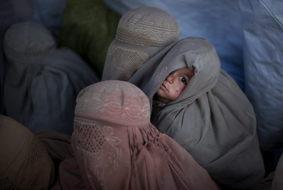
A Pakistani child looks on as women covered with burqas from the tribal region of Bajur and Mohmand agency wait to be registered at the Jalozai refugee camp near Peshawar, Pakistan, Friday, Jan. 30, 2009. (AP Photo/Emilio Morenatti)

While looking through the first few of Morenatti's photos I find that they are very dark and ominous. While at first I was unsure about this, I am growing to like this dusky and overcast style because his images are never drab. The connection with the child in this image really pulls you into this world.

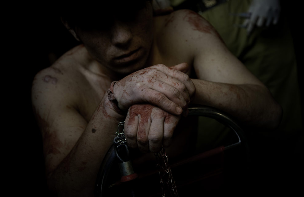
A Shiite Muslim worshiper receives medical care in a clinic, after flagellating himself with knives in a procession in Rawalpindi, Pakistan, on Monday, Feb. 16, 2009. (AP Photo/Emilio Morenatti)

Although there is blood clearly smeared on this man's hands and body this image is not grotesque. The subdued colors help as well as shrouding the man's face. You feel as if you know something about this human, but you also feel that he is not being exploited by the photographer.

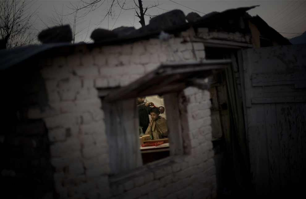
A Pakistani barber cuts the hair of a boy in a barber shop on the outskirts of Islamabad, Pakistan, Friday, Jan. 31, 2009. (AP Photo/Emilio Morenatti)

The natural framing is what drew me into this photograph. There is a good feeling of space here both inside and out. While the focus is on the boy getting his haircut who is framed neatly in the center by the window, you also get a sense of what season it is by the bare branches outside the building as well as the detailing of the bricks.


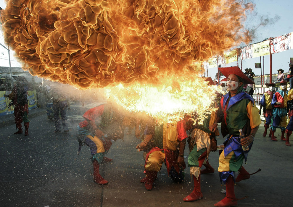
A group of jesters spit fire during a carnival parade in Barranquilla, Colombia, Sunday, Feb. 22, 2009. (AP Photo/ Fernando Vergara) Seen on Boston.com's Big Picture blog.

This is an astonishing capture. You can feel the heat as well as the lighter fluid splattering forth from his mouth. The texture in the flames is incredible. The colors, the movement, everything in this photo makes you stop and wonder at it in awe.

Tuesday, February 17, 2009

Class 5 -Chika A.

This photo was taken by Sam Mircovich for Reuters. It's a weather photo of an impending rainy day over Los Angeles. The picture captures the bleak gloom of weather, but encapsulates the city's skyline in an almost snowglobe fashion. I think the photographer made good use of natural light.

This picture features He Pingping, the world's shortest man. It was taken by Yoshikazu Tsuno for AFP. This picture works well because it's all about perspective. Even without a caption, a viewer could see that Pingping is unusually small for a man, because of the juxtaposition with the shoe.


This picture comes from Shaun Curry for AFP. It shows a child playing rock, paper, scissors with a robot at the Science Museum in London. I think it works because although there are only two objects in the frame, a viewer knows exactly what is going on. And the blue backdrop, whether it be a wall, or cloth, is out of focus, and provides a good contrast.

Class 5-Eleni Crush

Source: http://www.nytimes.com/2009/02/18/nyregion/18insure.html?ref=nyregion

Another example of environmental portraiture. Although sometimes it's hard to appreciate these "staged" shots, I like how the bills are surrounding her (the accompanying article is about how uninsured young adults deal with expensive medical bills). The darkness of the room makes it hard to see her clearly, but adds to the entire "doom and gloom" message that the article carries.

Source: http://www.nytimes.com/2009/02/08/theater/08itzk.html?_r=1&scp=4&sq=maggie%20gyllenhaal&st=cse

This is from last Sunday's New York Times article about how actual couple Maggie Gyllenhaal and Peter Sarsgaard are appearing onstage together in a revival of Chekov's "Uncle Vanya" at the Classic Stage Company over on East 13th street. We were talking about environmental and celebrity photography last week, and I thought this was an especially effective image. Both Gyllenhaal and Sargaard are well respected and pretty famous actors in the independent film worlds and have had many photos taken of them, but this one uses color very well. I like the red on Maggie and how it pops from the otherwise grey tint of the rest of the shot. It says something about the couple and their chemistry. Also, it was a good choice to have Maggie looking away from the camera. Again, this brings personality and a different perspective to the shot.

Source: http://gothamist.com/2009/02/16/early_addition_198.php
Gothamist does this one feature daily where they round up quick news from around the city and it's always accompanied with a photo selected from a Flicker.com stream that I believe users can tag as "gothamist" and that's how the photos get to Gothamist. Granted, this isn't from a traditional media source but it's an example of how new media can fit into this whole equation. I love the perspective on this shot--traditionally the eye goes from left to right, but in this photo, the woman on the left is slightly out of focus, leaving the model on the right in focus, and it's very effective.

Tear Sheets // Feb. 17, 2009 // Rose Walano


The first picture was featured in The New York Times, concocted by Viktor Koen. It was paired with a (duh) article on cell phones. WHat I found interesting was the combination of a classically-styled, almost vintage shot of a business man with a modern piece of technology and the dated but moderately modern neon, motel-like sign connecting the two. It's a sassy combination of new and old that hints to the themes within the articles (i.e. what we've expected from cell phones thus far, where they are going). Ah, the power of Photoshop.

The second picture was also featured in The New York Times, this time in the Arts section. It was taken by Saeed Adyani for MGM Studios. The picture is of a cast member for the remake of Fame, a movie I have loved forever. More importantly though is the sly placement of this picture. It's the snapshot for an article called "California Beckons Film Crews." Seemingly, this is a relatively boring, business-related piece - not so interesting for the artsy types who read this section. However, I think the article became infinitely more intreating to people upon seeing this touchstone of a picture. And on an aesthetic level, I love the way light is captures, shining down on her from an angle. Class theater.

Finally, this last AP picture is of seven-year-old Aaron Van Blerkom. Thanks to this picture, he is now the most notorious contributor to the "Dear Mr. President" project. He has the most adorable smile - both innocent and mischievous - and this devilish quality make him more than just a child. He embodies youth and sweetness. The use of color in this picture is both eye-catching and symbolic. There is an excessive amount of red, white and blue. It drives the message home: kids can be patriots too. 


 http://www.nytimes.com/2009/02/15/nyregion/long-island/15Riceboat.html?ref=nyregion

The first picture uses color to attract attention. The red stands out against the icy background and emphasizes the ice boat- not the ice. The photographer used panning to great effect keeping the iceboat in focus and the background blurry, showing the speed of the boat. This really illustrates the story well- its about ice sailors who get excited when lakes, rivers and bays freeze because they enjoy they are “speed addicts.”

http://www.time.com/time/picturesoftheweek/0,29409,1879163_1844999,00.html


I love this picture of Michelle Pfifer (second picture) because it’s a unique type of a celebrity picture. Instead of taking a picture of just the celebrity, her face is barely showing in the corner of the picture and the paparazzi is taking over a picture. I’m not sure if the photographer intended for this picture to show what being a celebrity is like, but it does. It helps that Pfiffer’s face looks surprised and in awe instead of composed and smiley. The color helps make the picture stand out. 

http://news.bbc.co.uk/2/hi/in_pictures/7724355.stm

The third picture looks like an artsy display or a theater mask. Its actually part of a protest, a man is covered with what looks like blood and mud. The protest was held in Jakarta, Indonesia so the government would compensate people for displacements and injuries caused by a mud volcano in 2006. The picture is very effective because the man has his eyes closed and looks injured. It makes the reader imagine what the actual injuries would look like. The costume was very smart on the part of the protestors because effective images are more likely to get attention. I’m sure there were banners at the event, but this is a way so people who speak any language can effectively understand the story.


Class 5- By Tala Al-Husry


Class 5- Jamie Feldmar


This is an AP photo taken from BBC.co.uk, from a story about the French "Spiderman" who scaled a skyscraper in Hong Kong. This shot frustrates me because it's not detailed enough. I wish it had been more of a close-up, so I could see how the man is dressed (is he actually wearing a Spiderman costume?) and what kind of (if any) climbing/safety equipment he has. I don't think it does a very good job of explaining the story, especially with such an attention-grabbing headline-- this guy might as well be a window washer, for all I know. That being said, I do like the color contrasts of the metallic building and the bright clothing.


This shot comes from a slideshow about Fashion Week on the NYTimes website. I love the way it plays with our perspective of focus-- the only element we can clearly see in the photo is the mannequin head, while the real person is soft and blurry. There are also a lot of interesting lines making unusual angles here-- nothing is really symmetrical or centered, which is often the natural inclination when taking a photograph. I also like how the most physically large element of the shot, the back of the of the model's head, is not actually the focal point. There is a slightly surreal quality to the image, since it's a mirror reflection, that actually made me stop and try to decipher the photograph for several minutes.

This comes from a NY Times Health article about heart failure. It is obviously a posed shot, but still is an interesting environmental portrait of a hospital patient (thought this person is probably a model). The shot is sparse and overexposed, which mimics the physical qualities of many hospitals. I like that the subject ("patient") is not actually facing the camera-- again, something the viewer does not expect in a news story. Most photojournalists show the action of an event, but for the story this image accompanies, keeping things still and quiet tells the story better than an "action shot" would have.

Class 5-Jessica Lubin


This picture of Alex Rodriguez was a really cool shot. The story ran in Tuesday's NY Times about his latest drug issues. I feel like this photo was probably taken at an event awhile ago but I really like how you can see all the people around him-consruction workers, reporters, etc-in the reflection on his sunglasses. It reminds me of his star power and that those people could soon be nowhere to be found because of his drug use.


This was one picture of many accompanying a story about how a drought in Texas is really effecting farmers and Texas in general. It ran in last Thursday's NY Times. There was an accompanying slide show online (http://www.nytimes.com/slideshow/2009/02/12/us/20090212drought_index.html?ref=us) that is really great. All of the photos are environmental portraits but they are really stunning. The picture above is my favorite (and was the main picture of the story) because it really captures the entire story. A farmer's livelihood is at stake because of this incredibly long drought, with the obviously brown, dried dirt below his cowboy boots-the reader knows exactly what's going on. It was a really creative approach that worked.


This story accompanied a really great new look at city budget cuts in Sunday's NY Times. This man is an aspiring firefighter whose dream was cut short because of the hard economic times for the past few years. I really liked this picture because it captures the hope in his eye as he leans against a firehouse. It's also cool because you can see the photographer in the door's window. You're not supposed to see him I know, but I think that it's ok because I didn't notice him until after looking at this picture for a long time. The contrast between the red door with its squares, and the plainness of the subject, really make the aspiring firefighter stand out.

Class 5- Meghan Everlanka


2.13.09 The City section of the New York Times, Photo By: Yonnete Joseph. I found this image interesting because normally you don't see an average person going down into a manhole. Its one of those unexpected images. The story was about an abandonned train tunnel on Atlantic Avenue in Brooklyn, apparently tourist and children take tours of the abbandoned tunnel. The images are interesting and catch your attention.


2.17.09 Technology section of the New York Times, Photo by: Kevin Moloney. This photo is interesting because of all the angles captured in the photo. I also think it is interesting that the article was about how to take a better snowboarding picture. It was interesting that the article talked about different shutter speeds and the different effects they would have on the photo. I also like how the light is right behind the snowboarder, it gives the figure a glowing effect.


This is from the BBC world news, it is from the AP. In Pristina, Kosovans in traditional dress mark the first anniversary of its declaration of independence from Serbia. I think the use of this lens is really interesting and catches the eye. Although it is artfully presented, I would have to look at the caption to understand what is going on. Also the photo captures a lot of movement and excitement but it lacks clarity.